That's awful. They changed equipment suppliers and there's a fucking street party? I hated adidas and all that too but chrissakes already...
Announcement
Collapse
Please support the Forum by using the Amazon Link this Holiday Season
Amazon has started their Black Friday sales and there are some great deals to be had! As you shop this holiday season, please consider using the forum's Amazon.com link (listed in the menu as "Amazon Link") to add items to your cart and purchase them. The forum gets a small commission from every item sold.
Additionally, the forum gets a "bounty" for various offers at Amazon.com. For instance, if you sign up for a 30 day free trial of Amazon Prime, the forum will earn $3. Same if you buy a Prime membership for someone else as a gift! Trying out or purchasing an Audible membership will earn the forum a few bucks. And creating an Amazon Business account will send a $15 commission our way.
If you have an Amazon Echo, you need a free trial of Amazon Music!! We will earn $3 and it's free to you!
Your personal information is completely private, I only get a list of items that were ordered/shipped via the link, no names or locations or anything. This does not cost you anything extra and it helps offset the operating costs of this forum, which include our hosting fees and the yearly registration and licensing fees.
Stay safe and well and thank you for your participation in the Forum and for your support!! --Deborah
Here is the link:
Click here to shop at Amazon.com
See more
See less
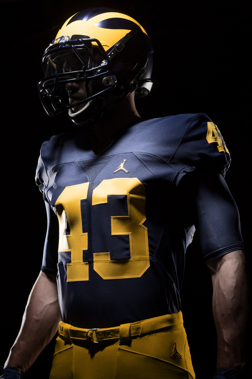
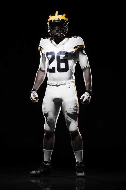
Michigan Football, Team 137, 2016 Season.
Collapse
X
-
I perused MDen online this morning and nothing really jumped out at me where I thought "Oh, I need one of those!". All that needed to be done was fix the maize and that was accomplished last year. If anyone knows of an Adidas clearance sale let me know. Also, the Jumpman logo is too big.
- Top
Comment
-
Aren't they putting more stuff out at the BBQ?F#*K OHIO!!!
You're not only an amazingly beautiful man, but you're the greatest football mind to ever exist. <-- Jeffy Shittypants actually posted this. I knew he was in love with me.
- Top
Comment
-
Harbaugh says the white pants on the road will be a permanent thing. He's a fan of that. And so im I, like the details of the arm/shoulder stripes. I love that the color and width match the maize stripe on the helmet. Great little touch there. No weird piping...no swatches of maize anywhere. Simple and clean. I suspect the same maize stripe matches on the pants as well. The numbers have changed (see above pic). The 2, 4, and 5 stand out to me as being notably different from the previous font.
Home: jerseys have remained unchanged, as well they should.
Helmet: that's a matte finish. Not as matte-ey as the matte used in the Outback Bowl a few years ago, but it's close. We'll need the light of day to make a good judgement on that one. Word is, those will be the helmets used this year.
- Top
Comment
-
Verdict on the jerseys, everyone?
The late mid to late 90's home were nearly perfection, clean and classy. That version of maize was my preferred, more yellow than the 70's but not the highlighter we've seen lately...
I LOVE that were uniquely the only Jumpman football school (for now), hopefully that's a distinction that only one or two programs at most in a conference. Overall, I give them an A- well above anything Adidas attempted. Hopefully the 'font' grows on me though seeing live or in TV might change my opinion. For the most part, Nike played it safe by not messing up an already great, classic jersey...
Away jerseys? I much prefer maize pants, they look much nicer with the white jersey. Way too much white and not enough maize. The away jersey (top) is pretty good relative to our past ones. Again, need more maize somewhere, just a small outline around the letters?
I'm guessing we'll see a couple alternates for a game (or 2) this season. Nike needs their investment to pay off so we'll see alternates for sure that people will buy. The potential alternates has been my larger concern than the home, away jerseys.
- Top
Comment


Comment