If this is your first visit, be sure to
check out the FAQ by clicking the
link above. You may have to register
before you can post: click the register link above to proceed. To start viewing messages,
select the forum that you want to visit from the selection below.
If you are having difficulty logging in, please REFRESH the page and clear your browser cache and try again.
If you still can't get logged in, please try using Microsoft Edge, Google Chrome, Firefox, Opera, or Safari to login. Also be sure you are using the latest version of your browser. Internet Explorer has not been updated in over seven years and will no longer work with the Forum software. Thanks
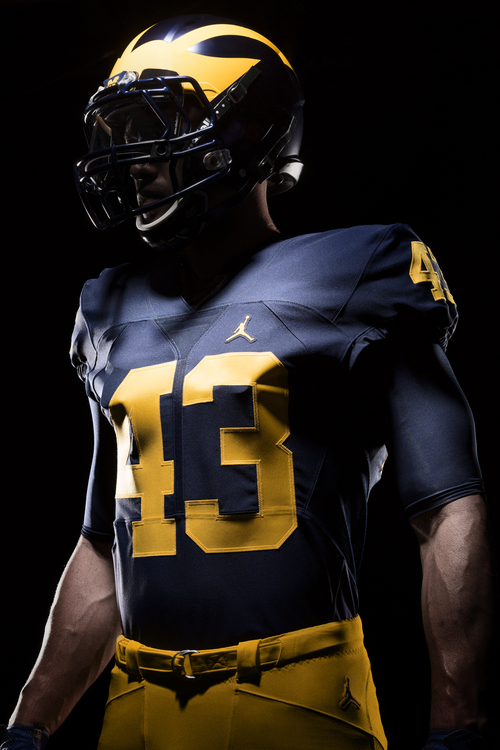
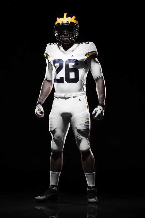
Hard with the lighting to compare. If anything though, it would be important to really just get the colour consistent across the helmet, jersey, pants, etc.
I'm not a big fan of the top part of the 4. Aside from that and the logo change, it looks pretty much like last year's uni. I'm happy they didn't fuck with the best unis too much.
The two is an unmitigated disaster. Worse than the halo and the noodle and coke promotion and the lack of full awareness and islamofascism and Putin. I wish they'd not have that stupid two. But apparently there a reason for that 4 and I can get behind that for sure: http://www.detroitnews.com/story/spo...sity/87961044/. At least there's a reason, unlike that fucking 2.
 Tweet
Tweet


Comment